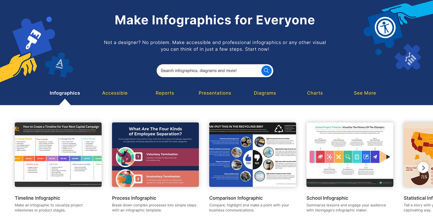
Try Venngage to make accessible infographics📊
It's now easier to create professional quality business visuals anyone can access
Venngage is a design tool for easily making professional-quality infographics. I’m impressed with the newest version’s focus on accessibility and ease of use.
What you can do: Starting with a template, within 20 minutes you can make a detailed graphic to include in a social post, presentation, etc.
What’s distinct about Venngage: The service prioritizes features that help ensure your visual is accessible, i.e readable by people with visual impairments.
How it’s different from Canva or Adobe: Venngage specializes in business infographics and internal communications — it’s not an all-purpose design tool.
Read on for seven ways Venngage helps you make accessible infographics.
1. Pick from templates designed for accessibility
Venngage’s new templates are designed to ensure that millions of people with visual impairments — including color blindness — can understand the data depicted.
Why this matters: Leveraging accessible templates eliminates extra formatting steps.
How to start: Browse Venngage’s accessible templates when beginning a new design project. Pick one that resonates, then modify as needed.
2. Generate text descriptions of images with AI
To be accessible to all viewers, images online should be annotated with alt text, which is a written description of an image on a Web page.
Alt text helps screen reading devices explain to viewers what’s in an image if they can’t see it clearly on screen themselves.
A screen reader is assistive technology— often used by people with vision impairments— that converts images or other elements on a screen into speech or braille.
Venngage has an AI feature that can automatically generate detailed alt text descriptions of images for those who use screen readers. That’s helpful because if you’re not used to creating alt text, it can be tricky and time-consuming to do it thoroughly by hand.
Why this matters: It’s much easier to add detailed alt text with AI assistance.
How to use this: Tap a button (screenshot below) to have AI-generated alt text added to any image. You can then edit it as needed.
3. Simulate how your graphic will look to those with various visual impairments
A built-in accessibility simulator shows you how your creation will appear to users with various visual impairments, including those who are color blind. This kind of immersive perspective-taking promotes empathy.
Why this matters: Simulating what your viewers will see can motivate you to improve your visual for all viewers.
How to use this: Test your design by tapping on multiple vision profiles. You’ll experience its accessibility firsthand. (See a gif of this in action).
4. Check live color contrast indicators
When adding visual elements, indicators notify you if your color contrast might be problematic for those with vision issues. The real-time visual feedback lets you make quick adjustments.
Why this matters: Identifying contrast issues helps you avoid creating inaccessible graphics.
How to use this: If the indicator finds your contrast lacking, adjust colors until the warning disappears.
5. Check your graphic’s overall accessibility
Venngage has a built-in accessibility checker to warn you of potential issues before you finish designing your graphic. The early feedback allows you to address accessibility issues before you share completed work.
Why this matters: Proactive accessibility checking saves time and money compared to retrospective remediation.
How to use this: Run the checker on every design as part of your workflow.
PowerPoint and other software tools also have accessibility checkers, but they tend to be buried and they don’t make it easy to remedy problems you encounter.
Sponsored Message
If you’ve been using the same password for everything since high school, it’s time to graduate.
Let Keeper Password Manager replace your password post-its and notebooks and only remember a single password for the rest of your life!
Keeper will generate, store and autofill passwords for you, on all of your devices. Get up to 50% OFF when you shop today!
6. Include formatting that helps screen readers
Any header or text you add to a design automatically includes formatting. That clarifies your graphic’s hierarchical structure for anyone using a screen reader. Clearly marking headlines vs. ordinary text makes sorting out text easier for those relying on assistive tech.
Why this matters: Labeled headings allow assistive tech users to navigate and understand content more easily.
How to use this: Style your main content sections as Header 2 and visual titles as Header 1.
7. Simplify text with AI
Venngage lets you use AI to simplify text on infographics and other visuals, enhancing readability. That can widen comprehension without much additional effort for all viewers, whether or not they have a visual impairment.
Why this matters: AI assistance can help you clarify text in your graphics.
How to use this: Generate simplified text options with one click after entering your original text.
What other accessibility resources do you like? Leave a comment 👇
Partner Message
Navigate the AI Revolution with Adepto
We're delighted to introduce you to Adepto, a tri-weekly newsletter demystifying the intricate world of Artificial Intelligence. With over 115,000 subscribers, Adepto offers succinct, digestible updates on AI's latest advancements, all without the unnecessary jargon.
By joining Adepto's community, you gain access to a wealth of information tailored not just for experts, but for anyone intrigued by AI. Subscribe now. It's an effortless way to stay updated, and it's completely free.
Bonus Accessibility Resources 🎁
Learn more about accessible colors with a thorough one-page guide.
30 accessibility tips from the University of Washington’s AccessComputing
Accessible Colors 101 Infographic A Venngage template I adjusted
Pick an accessible color palette with Venngage’s free palette generator.
1 out of 8 people have an impairment
A billion individuals — one out of eight people— have a physical, sensory or learning impairment. That’s something I learned from a piece by my former entrepreneurial journalism student Jason Strother, founder of Lens15 Media.
Yet I haven’t seen a design tool with as robust a focus on accessibility as Venngage. Visual content is ubiquitous, yet much of it remains inaccessible.
To address that, I’m hoping others follow the lead of Venngage CEO Eugene Woo in proactively prioritizing accessibility. When I interviewed Woo recently, he noted the proliferation of PDFs and other designs online that aren’t accessible to those with visual impairments. Let’s hope Adobe, Canva, Apple, Figma and others follow Venngage’s lead in 2024 in ensuring a greater percentage of resources are accessible.
Coming Up: Catch up on AI
🔔 Join a masterclass I’m co-leading on Generative AI for Media Pros starting next week!
I’m co-leading this live short masterclass with Nikita Roy, journalist, data scientist, media entrepreneur and host of the Newsroom Robots podcast.
Find out more and reserve your spot — join by Sunday, Dec 1! If you need a scholarship or would like more info, reply to this post to message me.